When it comes to bus bench and shelter advertising, one thing matters more than anything else:
Can people read your ad in a few seconds?
Unlike print ads or websites, outdoor ads are seen quickly, often just a glance from a passing car. That’s why simplicity is critical.
At 20/20 Media, we’ve seen what works and what doesn’t. Here are the most common mistakes businesses make when designing their ads, and how to avoid them.
1. Trying to Say Too Much
The Problem:
Many businesses treat a bench or shelter ad like a flyer. They try to include:
- Every service
- Full addresses
- Long descriptions
- Multiple phone numbers
The result? No one reads anything.
The Fix:
Focus on:
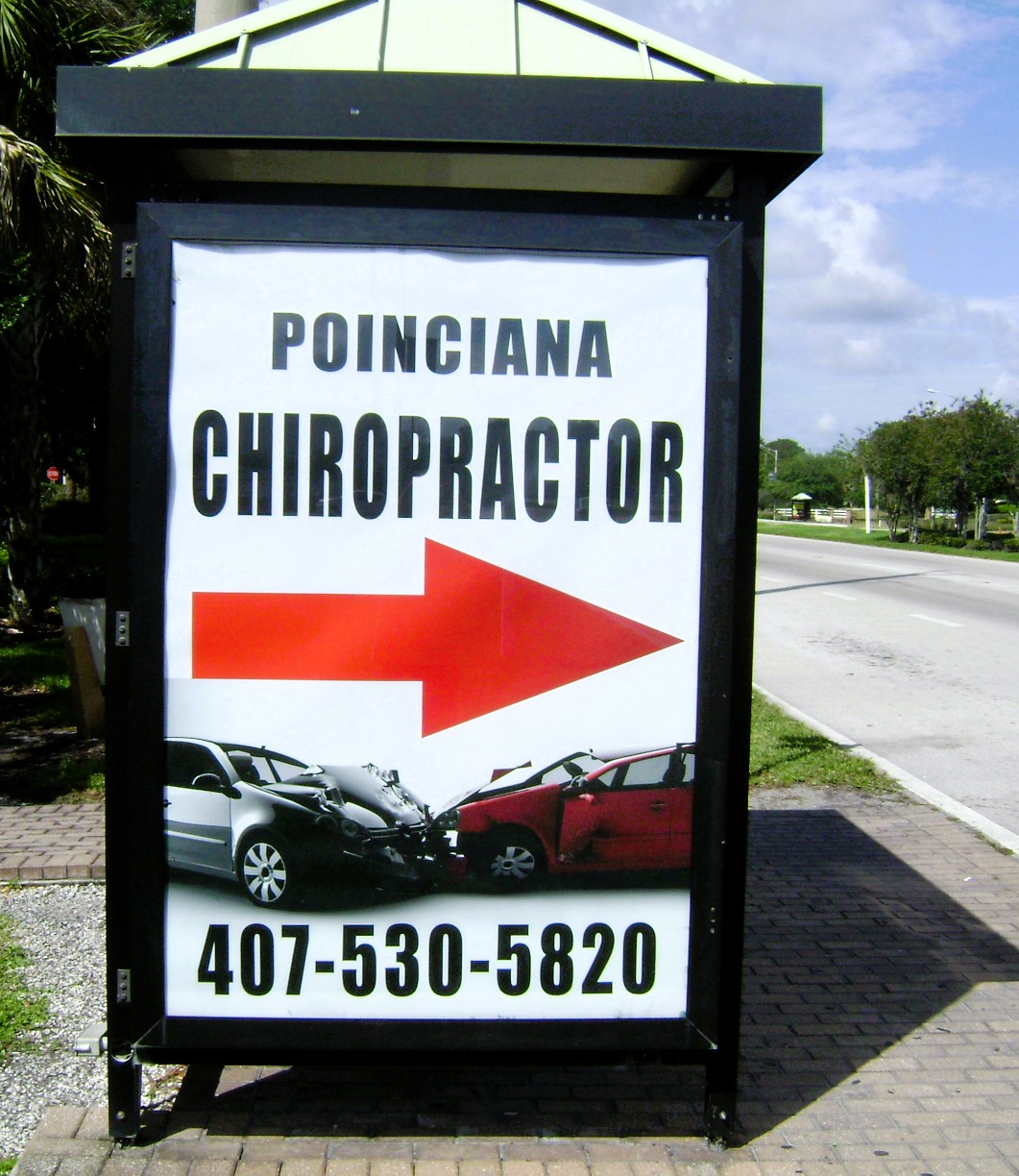
- Business name
- One main service
- Phone number
That’s it.
2. Small, Hard-to-Read Text
The Problem:
If your text can’t be read from a distance, it won’t be read at all.
Drivers don’t slow down to read your ad, they pass it.
The Fix:
- Use large, bold fonts
- Avoid thin or script fonts for key information
- Make your phone number the largest element on the ad
If it can’t be read in a few seconds, it needs to be bigger.
3. Poor Color Contrast
The Problem:
Light text on light backgrounds or dark text on dark backgrounds makes your ad nearly invisible.
This is one of the most common issues we see.
The Fix:
Use strong contrast:
- Dark background with light text
- Light background with dark text
High contrast makes your ad easier to read and more memorable.
4. Too Many Images or Graphics
The Problem:
More images don’t improve your ad—they overwhelm it.
Too many visuals compete for attention and confuse the viewer.
The Fix:
Use:
- One strong image (if any)
- Or keep it simple with no image at all
Clean, focused designs perform better.
5. Designing for a Screen Instead of the Street
The Problem:
What looks good on a computer screen doesn’t always work in real life.
Outdoor ads are:
- Seen quickly
- Viewed at angles
- Competing with traffic and distractions
The Fix:
Design for real-world conditions.
Ask yourself:
“Can someone understand this in one quick glance?”
If not, simplify it.
Why Simplicity Works
Bus bench and shelter ads are effective because they provide:
- Constant visibility
- Repeated exposure
- Targeted local reach
But they only work when the message is clear.
The best-performing ads are:
- Bold
- Simple
- Easy to read
- Focused on one message
Final Tip from 20/20 Media
If you remember one thing, make it this:
Less is more.
A simple ad that gets noticed will always outperform a busy ad that gets ignored.
Need Help Designing Your Ad?
At 20/20 Media, we specialize in creating ads that are built for real-world visibility—not just how they look on a screen.
If you’d like help designing an ad that gets results, we’re here to help.